BudgetCart




0→1 Product Design · AI UX · Mobile App · Accessibility · Ethical Design · UMSI SI 582
The cheapest item isn’t the cheapest grocery trip.
BudgetCart lets shoppers build a grocery list and compare complete carts across stores, with dietary fit and benefit eligibility visible alongside prices. The shopper chooses the store. My contribution focused on AI interaction and the Budget Calendar; Anne led buying and checkout, and Tunisia led onboarding and entry/account screens.
Status: a mobile prototype from UMSI SI 582, built by a team of three. Not a live shopping service or a benefits integration.
Role
AI interaction · Budget Calendar · team research and usability testing
Timeline
August 2025 - December 2025
Organization
Class Project
Tools
Figma — auto layout, variants, interactive prototyping
BudgetCart helps shoppers understand what is affordable, covered, and safe before they commit to a grocery purchase.
Cart comparison
Compare the cart. Keep the choice theirs.
A cheaper tomato doesn’t decide the whole trip. One cheaper product doesn’t tell you which store has the lower total for the entire list. So BudgetCart compares complete carts: each store’s item prices, its full cart total, dietary-fit and WIC/SNAP labels, and its own Select button. Step through the four details below.
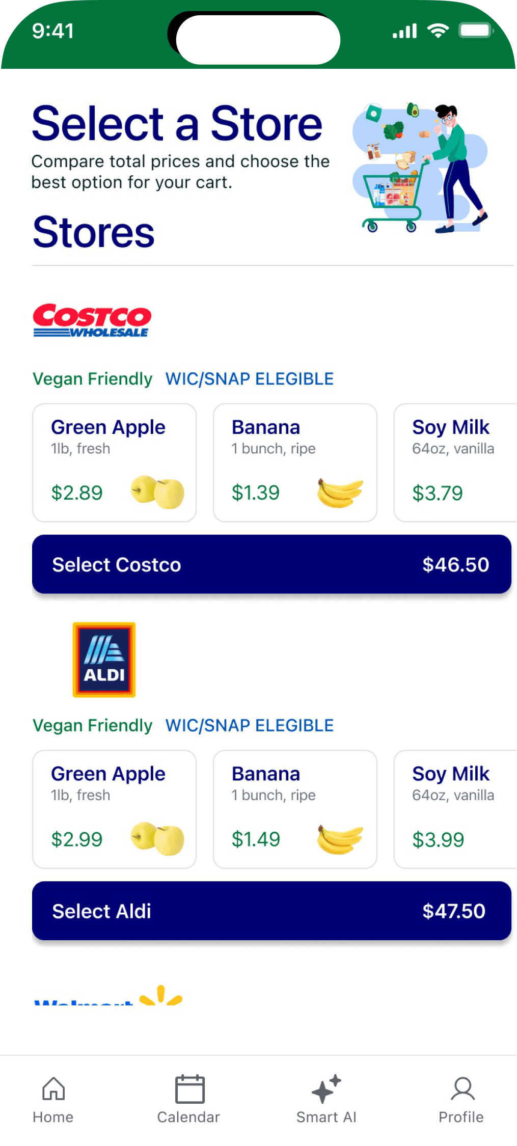
What the totals don’t show: benefit deductions or an out-of-pocket amount. Shoppers enter or link their benefits in the prototype; how that linkage and the eligibility calculation would work was not built or verified.
What testing exposed
First, people needed to understand the groceries.
The early flow asked people to pick a category before they saw any real items. In our low-fidelity testing, participants mixed up choosing groceries with choosing a market, and nested choices made them rely on memory. With brand and price hidden, people weren’t sure what they were getting.
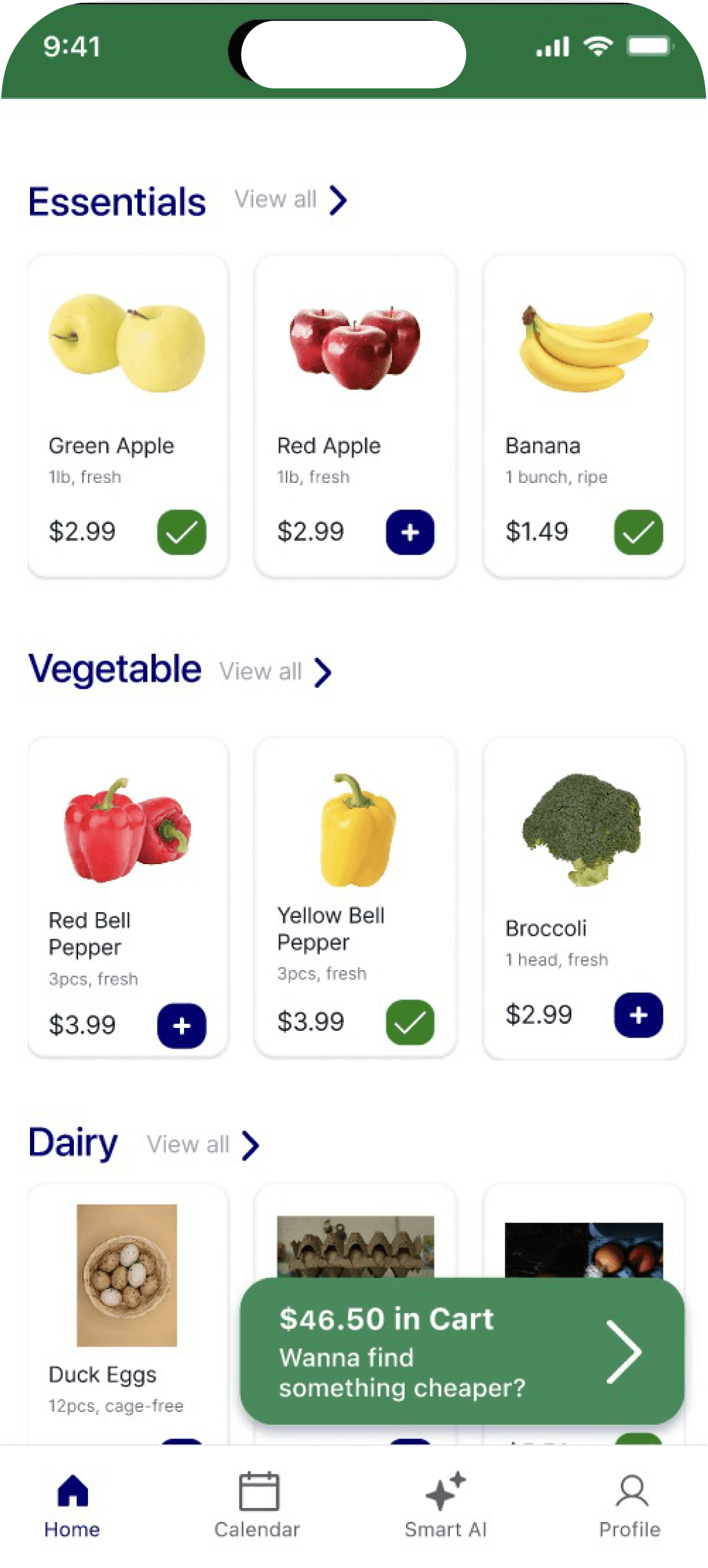
So the team made the decision cues visible: item-first browsing with prices on every product. You have to be able to inspect the products before a cart comparison means anything. Anne led this buying flow, and we didn’t measure an improvement from the change; it’s a direction, not a result.
My contribution
My work supported the choice before and after shopping.
My contribution focused on two parts of the app: the AI interaction that turns a list into a cart, and the Budget Calendar.
AI interaction
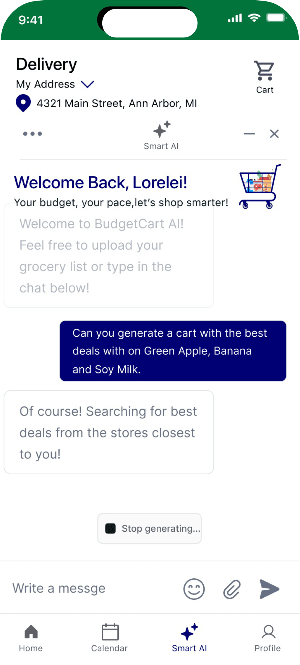
In our inspection, I flagged two gaps in the AI flow: unclear feedback while a list uploads or generates, and an unclear handoff from the AI’s answer to an actual cart. A plausible answer isn’t enough if people can’t see how it becomes their cart. The final screen invites people to upload a list or type one, has a paperclip for attachments, and shows a generating state they can stop. It’s a prototype screen; it doesn’t prove a working AI integration or a finished cart handoff.
Budget Calendar
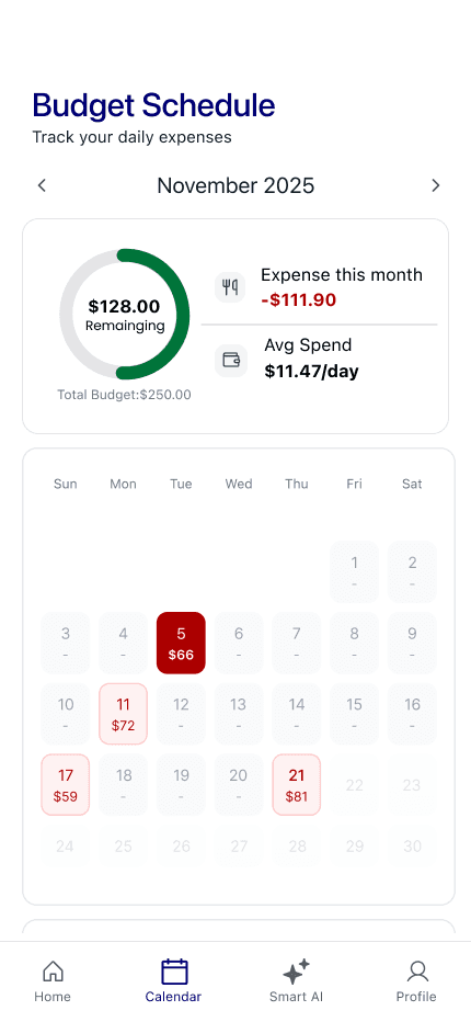
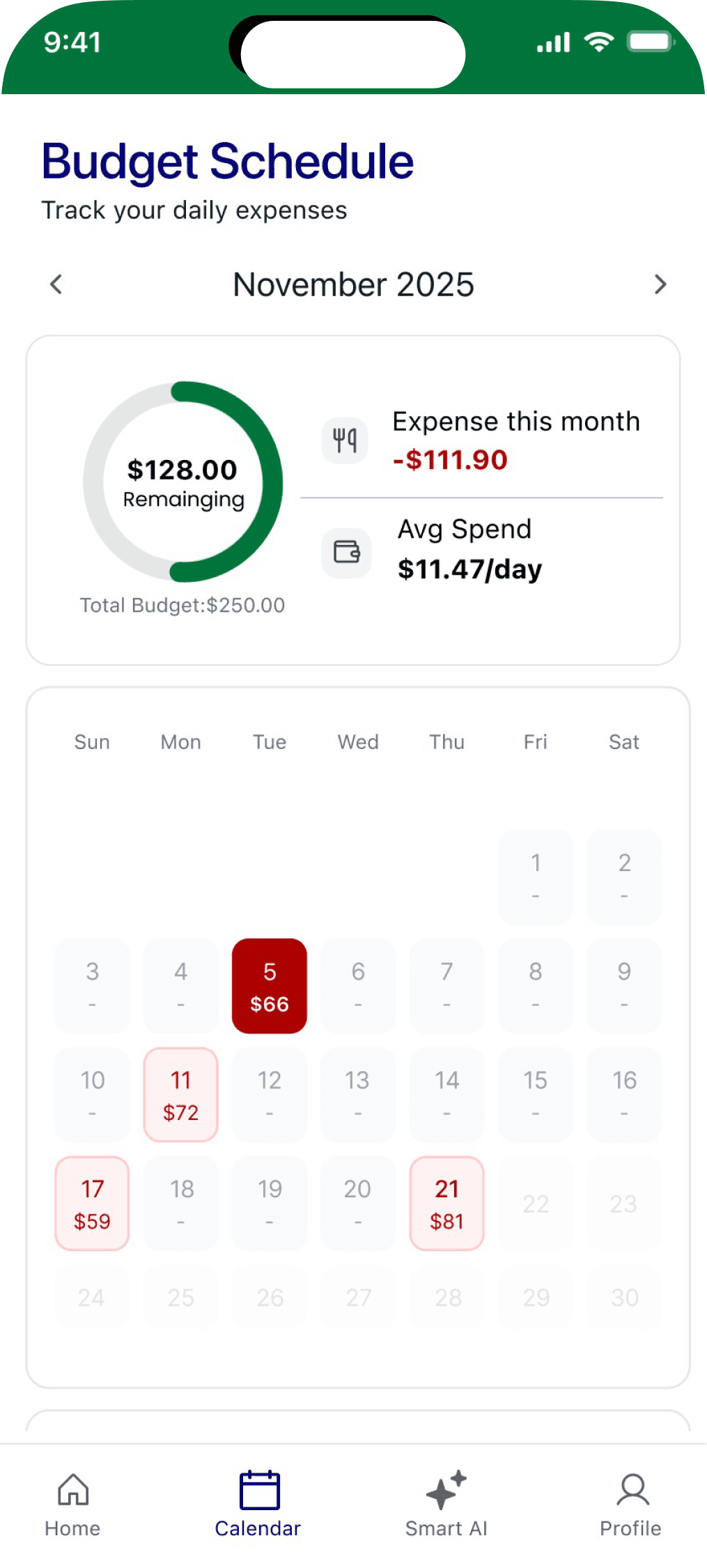
The calendar shows how much of the monthly budget is left, what’s been spent, and which days had expenses, so spending can be read by date.
What’s next
What we built, and what I would test next.
This is a mobile prototype, not a validated shopping service or benefits integration. No real savings or post-revision success rate is claimed.
Next, I’d test whether shoppers compare the same list across stores, understand the difference between totals and eligibility, choose a store without prompting, and move from an AI-generated list to the comparison without losing their choices.
Deeper read
Trade-offs, and the earlier write-up.
Five trade-offs behind the decisions above, then the original long-form case study, kept as it was.
Simplicity versus missing information
Hiding brand, price and store made early screens look simpler, but it also removed the cues people needed to compare. The early difficulties in testing came from exactly that: choices without enough to choose on.
Recommendation versus choice
The comparison shows the alternatives and gives each store its own Select button instead of picking one for the shopper. I read that as supporting autonomy; it’s interface reasoning, not a measured effect.
Benefits versus payable total
Eligibility labels and cart prices are different kinds of information. A WIC/SNAP label says an item may qualify; the total is still the full cart price. The prototype doesn’t calculate what someone would actually pay.
AI output versus a finished task
A sensible-sounding AI answer isn’t the same as a usable cart. If people can’t see how the answer becomes their list, the task isn’t done. That handoff is the part I’d test first.
Colour and hierarchy
The final screens use navy and green on white, consistently across actions, navigation and the wordmark. The reasons behind those colours aren’t documented, so I’m not claiming one.
The one-sentence case
BudgetCart started as a grocery app, but became a decision-support system after testing showed that users did not just need fewer choices — they needed the right decision cues at the right moment.
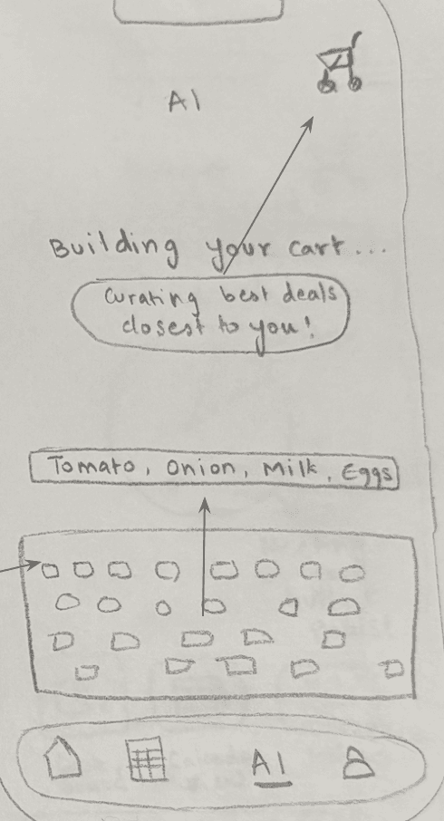

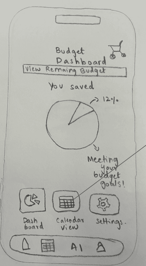
The final product direction brings budget, eligibility, safety, AI, and store comparison into one shopping flow.
The problem
Grocery apps show products. Budget-sensitive shoppers need decision support.
Most grocery apps help users search, add items, and check out. But for shoppers balancing budget limits, SNAP/WIC eligibility, dietary restrictions, and store choice, the hardest part happens before checkout. They are not only asking "Can I buy this?"
Existing grocery apps



Existing grocery apps optimize for transactions, but budget-sensitive shoppers need clarity before they commit.
The 0→1 product opportunity
The opportunity was to make the moment before checkout clearer.
The opportunity was not to make checkout faster. We saw grocery shopping as a sequence of tradeoff decisions, not a simple purchase flow. For users balancing money, benefits, and health needs, every item can affect the rest of the cart. So BudgetCart was built around one product bet: budgeting should happen inside the shopping flow. Not after checkout. Not in a separate finance tab. Not in a different budgeting app. At the moment users are deciding what to buy.
Before: budgeting lived separately
Budget tracking sat apart from grocery decisions—users did the mental math while building the cart
After: budget inside shopping
Budget visibility while users browse, add items, compare stores, and review substitutions
Onboarding → Budget Dashboard → Product Browse → AI Cart Builder → Substitution → Checkout Compare → Receipt Scan. The product system moves decision support into the shopping journey instead of making users compare across separate tools.
My role
Connecting user uncertainty to interface decisions.
I worked across the research and design process, with deeper ownership over the AI cart-building and budget tracking experiences. I contributed to problem framing around affordability, benefits, and dietary needs; research synthesis and product requirements; AI cart-builder interaction design; the budget dashboard and budget calendar flow; usability testing and iteration planning; and translating testing breakdowns into interface changes.
My main contribution was deciding what information needed to appear, when it needed to appear, and how much guidance the product should provide without overwhelming the shopper.
Research focus
We were studying the hidden decision process behind grocery shopping.
Before buying, users were weighing price, store choice, food safety, dietary needs, benefits eligibility, time, convenience, budget limits, and trust in substitutions. That changed how we framed the product: BudgetCart could not just be a cart. It needed to be a decision layer.
Before: "Track spending later."
After: "Support decisions now."
Personas
Hi! I'm Jade, I'm 22 and an Office assistant. I am also a single parent.
Hello! I'm James. I'm 34 and a Part-time warehouse worker.


Budgeting happens item by item: users make small, repeated decisions while shopping—choosing cheaper items, skipping extras, checking totals, and wondering whether a substitution is worth it.
Research insights
Four insights shaped the product.
Each insight paired what we saw in research and testing with a concrete product decision.
01
Users were budgeting while shopping
Users made small budget decisions item by item. A separate budget dashboard was not enough—budget information needed to appear inside browsing, cart-building, substitutions, and checkout.
02
Eligibility had to appear before checkout
SNAP/WIC uncertainty creates stress. We surfaced eligibility on product cards, product details, and checkout comparison—benefits are primary shopping signals, not secondary filters.
03
AI needed a starting point
A blank input created uncertainty. We added upload/camera cues and starter prompts—AI UX needs guidance, examples, and feedback, not just a text box.
04
Simplifying too much reduced trust
Removing brands and prices made users less confident. We moved to item-first browsing with lowest-price visibility—less information became better-timed information.
Simplicity only works when users still have the cues they need to trust the system.
Signature design decision
Price transparency during substitutions.
Many grocery and delivery experiences hide substitution cost changes until later. BudgetCart makes that cost explicit before the user confirms: if a replacement item costs more, the interface tells the user what changed and what the new total will be. This is not just a UI detail—it is an ethical design decision. For budget-sensitive users, a small substitution can affect the rest of the cart. By showing the price impact upfront, BudgetCart prioritizes user control over a faster checkout.
Instead of hiding substitution costs, BudgetCart makes the financial impact visible before users confirm. Ethical design can be embedded directly into microinteractions.
Design evolution
From clean but unclear to simple and trustworthy.
Our biggest design tension was: how do we reduce cognitive load without removing the information users need to feel confident? Version 1 was category-first with no brand, no store, and no price—we thought less information would reduce decision fatigue, but users struggled to locate items and felt uncertain without price cues. Version 2 shifted to item-first browsing—users found items faster, but still lacked confidence without price visibility. Version 3 added lowest-price visibility while keeping detailed store comparison until checkout—users could browse simply while still seeing enough information to trust the flow.
V1 · Category-first, no price
V2 · Item-first, still no price
V3 · Item-first + lowest price
Reducing cognitive load does not mean removing information. It means showing the right information at the right moment.
Outcome
The impact was product clarity.
Because BudgetCart was a student prototype, I am not claiming launch or business metrics. We moved from a broad grocery app idea to a sharper 0→1 concept: a grocery decision-support tool for people balancing affordability, benefits, and dietary needs. The prototype demonstrates the user experience and decision logic; the next step would be validating feasibility through real inventory data, eligibility databases, and more robust error handling.
What the prototype explored
Reducing uncertainty around SNAP/WIC eligibility, making grocery budgets visible during shopping, comparing stores with less mental math, making AI cart-building easier to start, protecting users from hidden substitution costs, and treating dietary safety and affordability as connected decisions.
What I would do next
This project changed how I think about accessibility.
Accessibility is not only screen readers, contrast, and labels. In BudgetCart, accessibility meant price clarity, benefit clarity, dietary clarity, less mental math, and more control at the moment of decision. Helpful products do not just give users more information—they give the right information at the moment users need it.
Not after checkout. Not in a separate tab. At the decision.
next case study